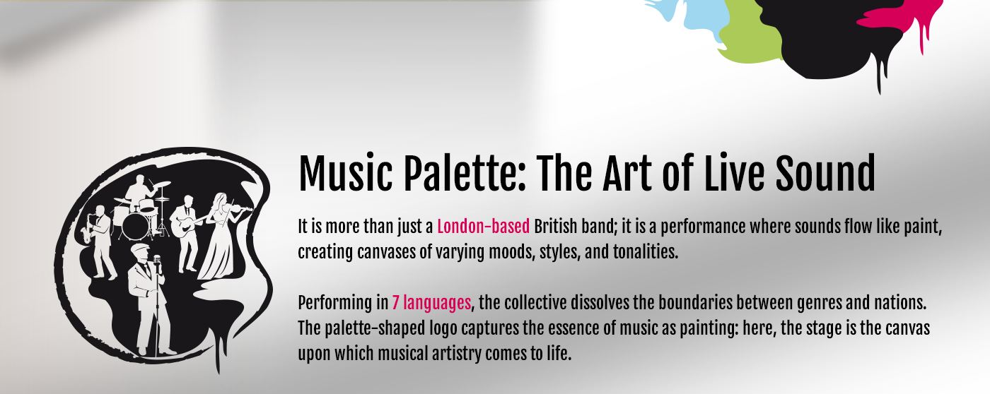
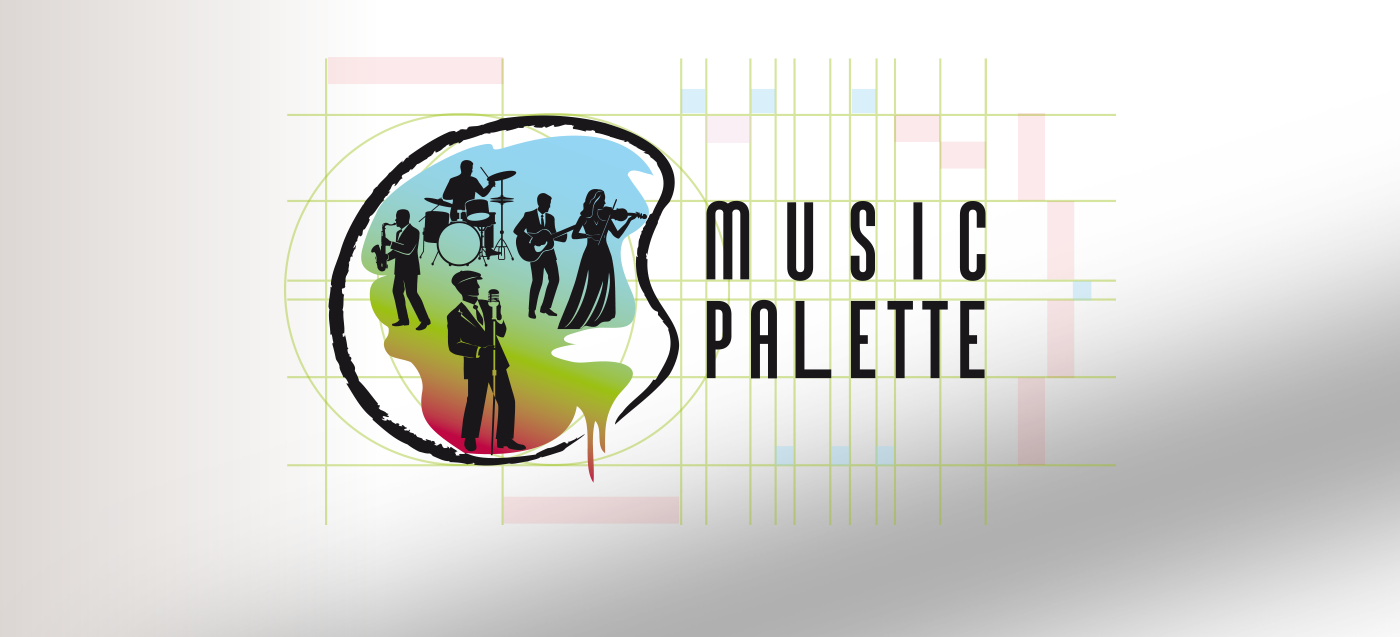
Optical Balance & Grid Construction
To achieve visual harmony, I developed a custom grid system that goes beyond simple alignment. A key technical challenge was balancing the negative space of the letters 'L' and 'E', as well as managing the rhythmic tension between the narrow 'I' and the double 'T'.
By using the grid to precisely offset these characters, I was able to center the letter 'U' from the top row directly above the stem of the 'L' below. This rhythmic spacing ensures consistent kerning for the word 'MUSIC', while giving 'PALETTE' a distinct improvisational character. The elongated stroke of the 'L' acts as a visual 'crescendo'—it captures the eye and creates a flowing, melodic foundation.
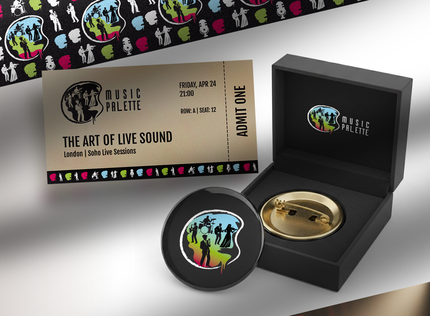
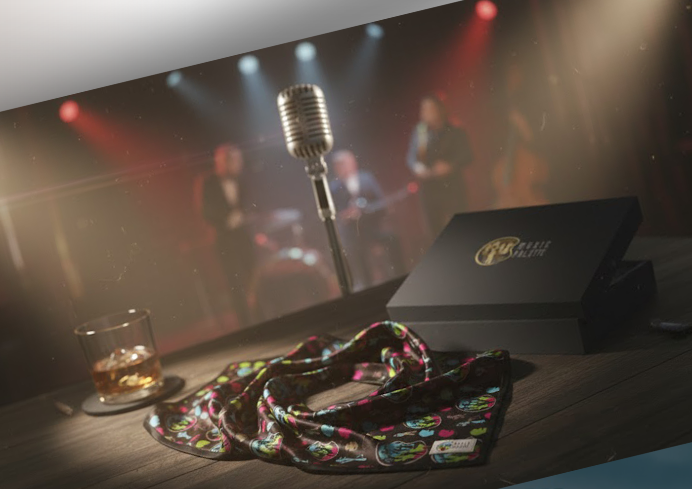
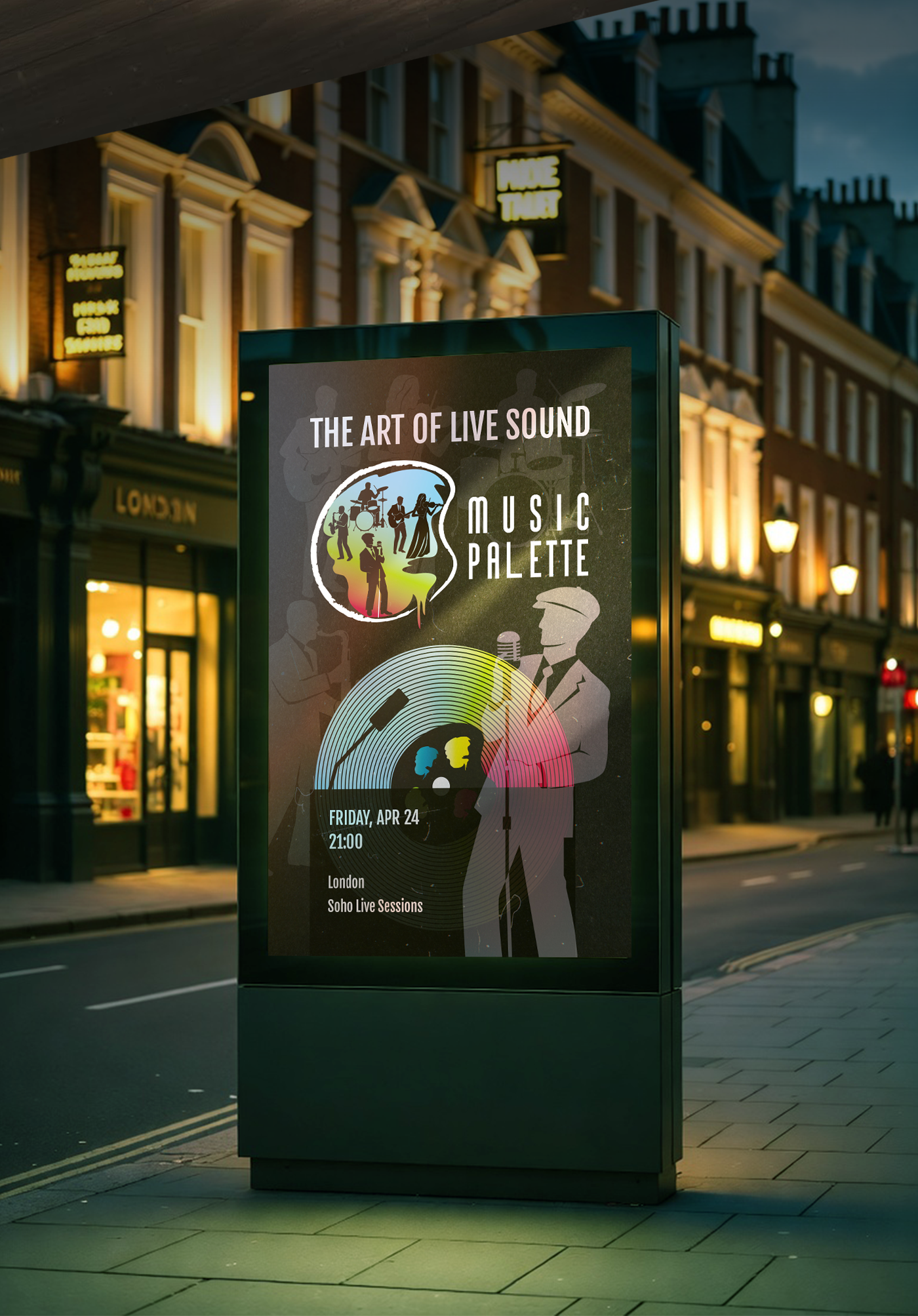
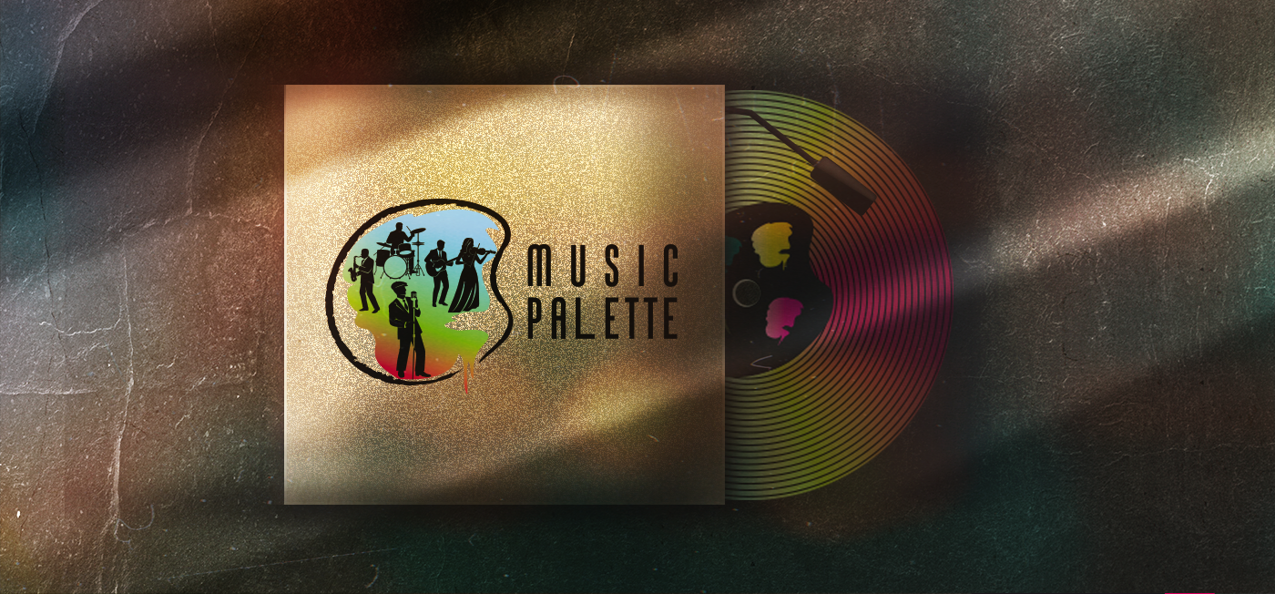
Music Palette — Painting the Sound
In this project, I was completely immersed in the band's atmosphere, so the slogans, style ideas, and the symbol itself were created in harmony with my thoughts and feelings. The band members and their stage personas were drawn from live concert footage and stories from the band leader, Romeo. If you are ever in London and attend one of their shows, I believe you will feel their 'palette of sounds' as vividly as I did while working on this project.
In this project, I was completely immersed in the band's atmosphere, so the slogans, style ideas, and the symbol itself were created in harmony with my thoughts and feelings. The band members and their stage personas were drawn from live concert footage and stories from the band leader, Romeo. If you are ever in London and attend one of their shows, I believe you will feel their 'palette of sounds' as vividly as I did while working on this project.